Cool or Warm? A Color Temperature Application Breakdown.
As lighting designers, our mission is to create captivating and memorable spaces. Light is a powerful tool that can influence individuals’ perception of a space, mood, and even health. Consider how aspects of light evoke or support a desired feeling or response.
In a previous post, we discussed the basics of color temperature and how design choices vary based on application and geographical location. Correlated color temperature (CCT) corresponds to the warmth or coolness of white light.
Cool color temperatures tend to be associated with alertness and task-oriented environments, whereas warm color temperatures are associated with comfort. We use these social norms associated with warm and cool light to our advantage as we identify the design intent of a space.
Appealing to an Environment
Choosing the most appropriate color temperature depends largely on a building’s purpose as well as the people it is meant to attract and the desired responses the space should evoke.
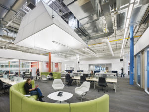
Lighting systems for corporate environments typically use a lighting temperature of 3500K to 4000K. These cooler color temperatures promote alertness and attention to fine detail.
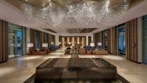
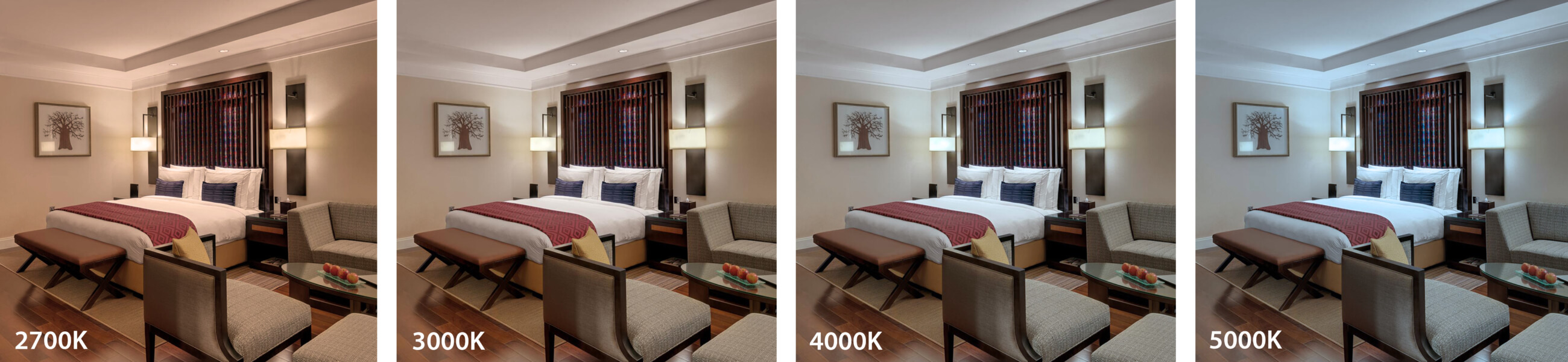
In hospitality settings, where comfort and luxury are often primary design goals, lighting systems are typically warmer with CCTs ranging from 2700K to 3000K.
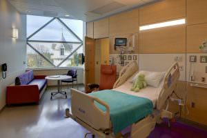
Throughout hospitals and other healthcare environments, CCTs vary based on the purpose of a given department or space type. Where alertness and attention to detail are critical – such as in exam rooms – the lighting design will typically be cooler. In recovery rooms, waiting rooms, and other areas where comfort is the primary goal, warmer temperatures are appropriate.
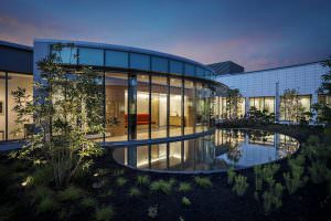
In exterior environments, color temperatures can range substantially depending on the space, designer preferences, and/or lighting standards. When the primary goal is to enhance the greens and blues of the landscape, for example, cooler CCTs will better achieve this goal. Warmer temperatures may be used to create inviting pathways and focal points for visitors.
Materiality Matters
The materials an architect and interior designer choose for a space also help dictate the appropriate color temperature of the lighting system. Warm CCTs enhance the use of brick, wood and terracotta, for example, whereas cooler CCTs better suit metals and marble.
Circadian Lighting
As we wake up and go to bed, we experience warmer color temperatures with the rising and setting sun. We experience cooler color temperatures when the sun is highest in the sky. Circadian lighting is based on the concept that the color temperature of electric light should mimic these changing color temperatures of the sun on its course throughout the day. Some studies have shown that being exposed to specific wavelengths of light in our day-to-day interactions can positively affect our circadian rhythm, health and general well-being.
Color temperature is one of the many tools in The Lighting Practice’s toolbox that helps our designers create successful lighting systems in the built environment. Working closely as a design team, we strive to identify critical variables like this to ensure the desired outcome of our projects are met.